With Haven, developer The Game Bakers brought us a pair of lovers, Yu and Kay, making a home on a forgotten world. This month Emeric Thoa, creative director, guides us through the influences and creation of the art in this beautiful and heartfelt game

Was the appearance of the game core to its initial concept?
I wouldn’t say Haven is an “art driven” game. Art is one of the three pillars of the game but not “the first pillar.” The biggest pillar was the game experience coming from the gameplay of living a couple’s life (so a mix of dialogs and exploration in Haven’s case). The art and music were also thought from the beginning as elements that must stand out.
Tell us how the art was created and by whom?
There were many different artists with high impact on the final result of the game on Haven. Koyorin designed the characters, their dialogue portraits and a lot of their attitude. Simon Hutt did a lot of the environment concept art and overall art direction. Anthony Beyer, as the technical art director, had a huge influence on the 3D render and all the visual effects. Yukio Takatsu made the opening and ending animations. And many other concept artists or 3D artists or animators worked on the game (Chris Hoareau, Benoit Leloup, Florian Coudray, Marjorie Deneux, Pierrick Kyburz, Lucie Bonzom…). Our internal art team was 4-5 people, but for specific needs, we commissioned artists (like Koyorin or Takatsu Yukio or Florian Coudray). If we feel we need help to achieve something outstanding in a specific area, we don’t hesitate to go look for talents outside of our team.
What influences (within or beyond games) did you draw from?
Because so many different artists worked on the project, the influences can vary a lot. Koyorin is a big fan of Japanese illustrators like Akihiko Yoshida, Shigenori Soejima, Shunsuke Saito, Yuya Nagai. Which is great because I am a fan too!
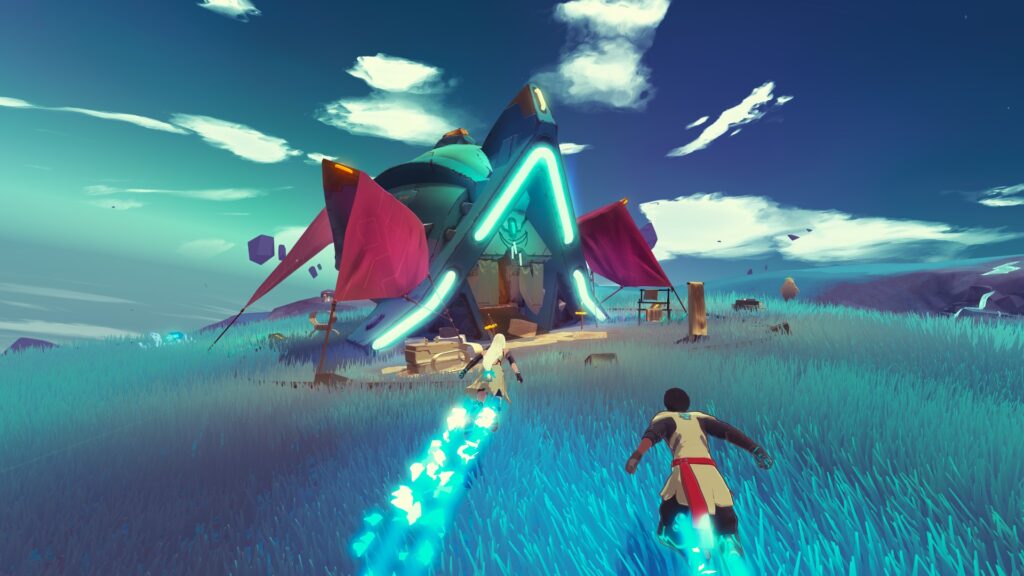
For Simon Hutt, a strong concept art influence for the environment is the first Star Wars trilogy, especially Ralph McQuarrie’s concepts and Doug Chiang also, for the ship parts and cables.
I also really like the feeling of technology in series like Dragon Ball (or in a way, Ghibli or Akira). It’s the right spot between technology and magic to me. The shapes stay simple but they also feel warm and nice. There’s no fire, just energy. Eventually, one of the biggest influences is just nature, and the feeling of gliding (or skiing) on a mountain slope together.
Can you put any numbers on the scale of the project?
Haven was for sure our biggest project to date in terms of concept art. We created so many art pieces… The game was rebooted after a year, so a lot of Koyorin art has not been revealed, but they produced probably 5 times more illustrations than what is in the final game. Five more characters, portraits, key arts! Just for the loading screens, we have 35 unique pictures of Yu and Kay together. And for the story, we have more than 200 narrative scenes in the game, so more than 200 illustrated storyboards from Benoit Leloup, and then animated in 3D.
What tools/techniques were used to create the game’s look?
We try to stay very simple in our techniques and focus on creating simple shapes, simple textures with little detail. We prefer a stylized look than going more realistic, it fits the idea of creating a fantasy world to me. A big part of the techart work was the work on the grass, which for optimization matters was made entirely with compute shaders. We also created tools to edit the terrain and cables, and although we work in Unity, all the lighting and shading code is custom on our side.
How did the art evolve with the project (if at all)
Well, the game at one point was a point & click exploration game, in 3D but with a point and click exploration mechanic. When we rebooted and added the gliding and terrain it changed the feeling a lot. The planet Source and most of the environment was completely redone and changed at this point.
The 2D art from Koyorin was not affected – except for changes from the reboot, a lot of what had been done was cut from the game, to refocus on a couple’s story.


 MCV/DEVELOP News, events, research and jobs from the games industry


